With SparkLayer, our goal is to make B2B eCommerce simpler and our toolset is designed to give great flexibility to merchants. Creating an overall customer experience that's as seamless as possible is key to B2B success, so we've put together our top tips on how to best configure your B2B website.
Many of these features are enabled by default with the SparkLayer Frontend and for others, we've provided some context for how they could feasibly be implemented on your B2B eCommerce site.
1. Accessing a B2B website
Overall, the B2B user experience is very different to a standard retail (B2C) website; prices and pricing rules (e.g. pack sizes) are specific to a customer and the storefront is largely designed to make ordering as efficient as possible.
For customers to access a B2B website and then begin ordering, there are typically two approaches.
| Approach | Details |
|---|---|
Total site restriction |
Customers have to sign in to gain access to any area of the site (even static pages). |
Login to see prices |
Customers can browse the site (just like any other B2C site) but in order to purchase or view pricing, they need to log in |
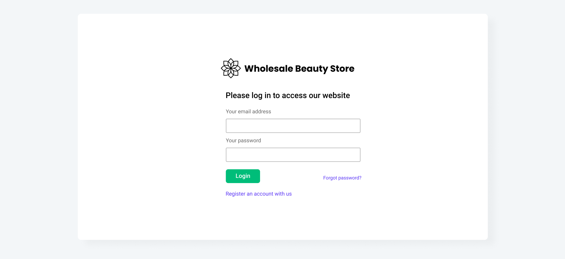
The approach taken does depend on a range of factors; perhaps you have a product range that you don't want non-customers to see. Conversely, you may want the entire site to be browsable to create interest in your products and to encourage potential customers to register a B2B account.
How to implement
Each approach will require some degree of bespoke logic to implement.
| Approach | Details |
|---|---|
Total site restriction |
A control will need to be set at a global level to always force the user back to a login page if they try accessing a URL directly |
Login to see prices |
Logic just needs to be applied to anywhere that renders product prices, e.g. a product listing and product detail page. The shopping cart should also be restricted to only load when logged in |
2. Registration form
If a user doesn't have an account on your B2B website, the user experience works slightly differently. Whereas on standard (B2C) websites, anyone can create an account, for B2B account access this is typically moderated. The user submits their details via a dedicated registration form and this is then reviewed before either being approved or rejected.
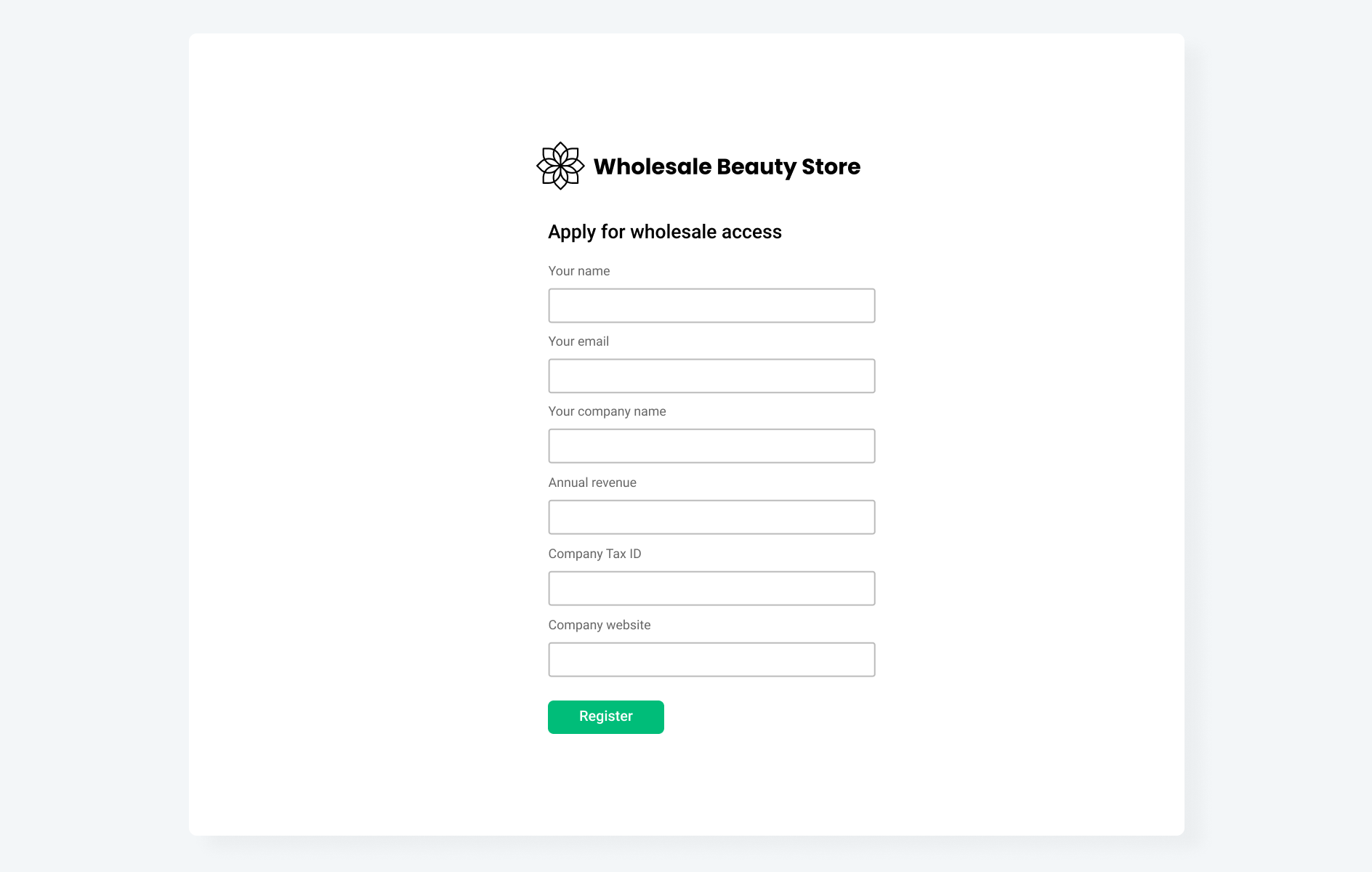
The registration form should ideally include the following data capture fields:
| Field | Details |
|---|---|
Name |
Customer's full name |
Email |
Main contact email |
Company name |
Registered company name |
Company address |
The full address of the company |
Annual revenue |
To give an idea of the customer's scale |
Company Tax ID |
e.g. VAT number or Company Number |
Website |
Company website URL |
Phone |
Main contact phone |
Additional Information |
Perhaps you may want to us specific questions such as why they want to stock your product range |
How to implement
If your existing registration form already supports data capture fields, it should be relatively straightforward to extend these to capture the additional fields required. This additional data capture may be stored as custom metafields or metadata against a customer record, which most eCommerce platforms should support.
3. Product Purchasing
When a B2B customer successfully logs in, they can then begin to browse the website to start creating their order. When they visit a product detail page, the interface should be designed to make it easy to add products to an order.
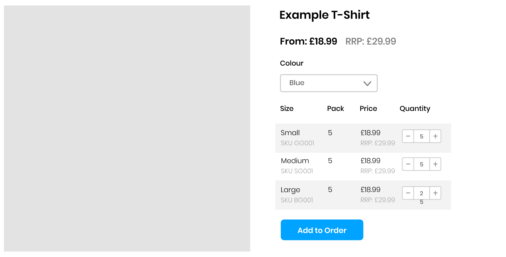
A well design product purchasing interface should include:
| Item | Details |
|---|---|
Clear pricing display |
The customer should clearly see their specific pricing and if the product contains variants, these should be displayed ideally in a table format |
Quantity button |
The customer should be able to easy increment and decrement quantities without having to type in numbers |
Pack sizes |
This should be clearly displayed and the quantity button should increment and decrement in this same quantity (e.g. 3, 6, 9) |
Retail pricing |
As a point of reference, it should display what the standard (B2C) product price is |
Price breaks |
If the customer saves money by purchasing more of an item, this should be clearly displayed in a table with all associated savings. |
4. Quick Order Cart
When a customer adds products to their order, they should ideally be added to a Quick Order Cart. This is a specially optimised interface that makes it quick for customers to build orders, update items, review total costs, and then proceed to checkout.
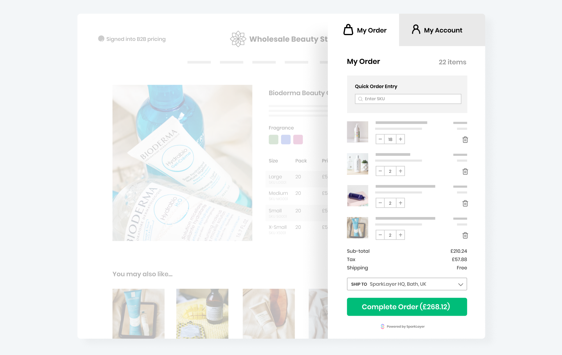
The Quick Order Cart should include the following features:
| Item | Details |
|---|---|
Easily accessed
|
Ideally, this should display as a 'modal overlay' that can be accessed from the main website navigation |
Quick search
|
A search box to allow customers to search products by name or SKU to add to their order |
Product list
|
All products in an order should be neatly listed and display
|
Order totals
|
This should display:
|
Proceed to checkout
|
A clear button for the customer to then checkout and complete their order. |
5. My Account Area
One of the goals of a B2B website should be to make as much as possible 'self service'. A great way to do this is to provide customers with a feature-rich My Account area that allows them to track order history, re-order the same items, see their address book, and more.
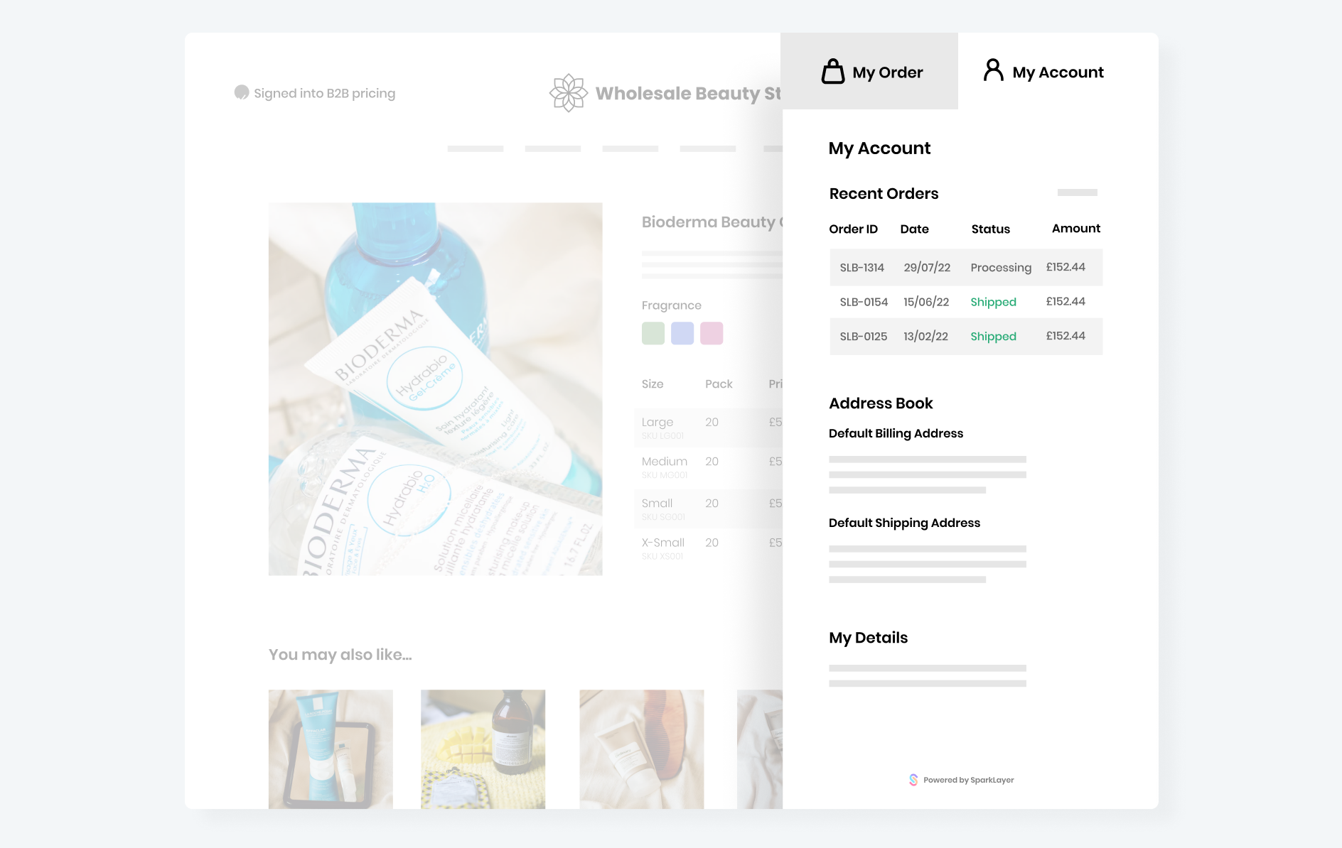
To give a great experience, the My Account area should include the following key features:
| Item | Details |
|---|---|
Order history |
A full list of a customer's online orders and, ideally, their offline orders too (e.g. phone orders) |
Order tracking |
A way for a customer to easily see the status of their order, e.g. processing, shipped |
Re-order |
A way for a customer to be able to re-order from a previous order. This should populate the Quick Order cart with the same items |
Address book |
A list of the customers default shipping and billing addresses, as well as any other available addresses they have on your systems |
Additional details |
This could include fields such as their account manager or special requests noted on their account |
6. Enhanced product page data
A common feature of B2B websites is to include additional B2B-specific content that is only shown when a customer signs in. Typically this will be shown on a product detail page and may include such information as Bar Codes (or EANs), marketing material, perhaps additional links that point to marketing material for a specific product.
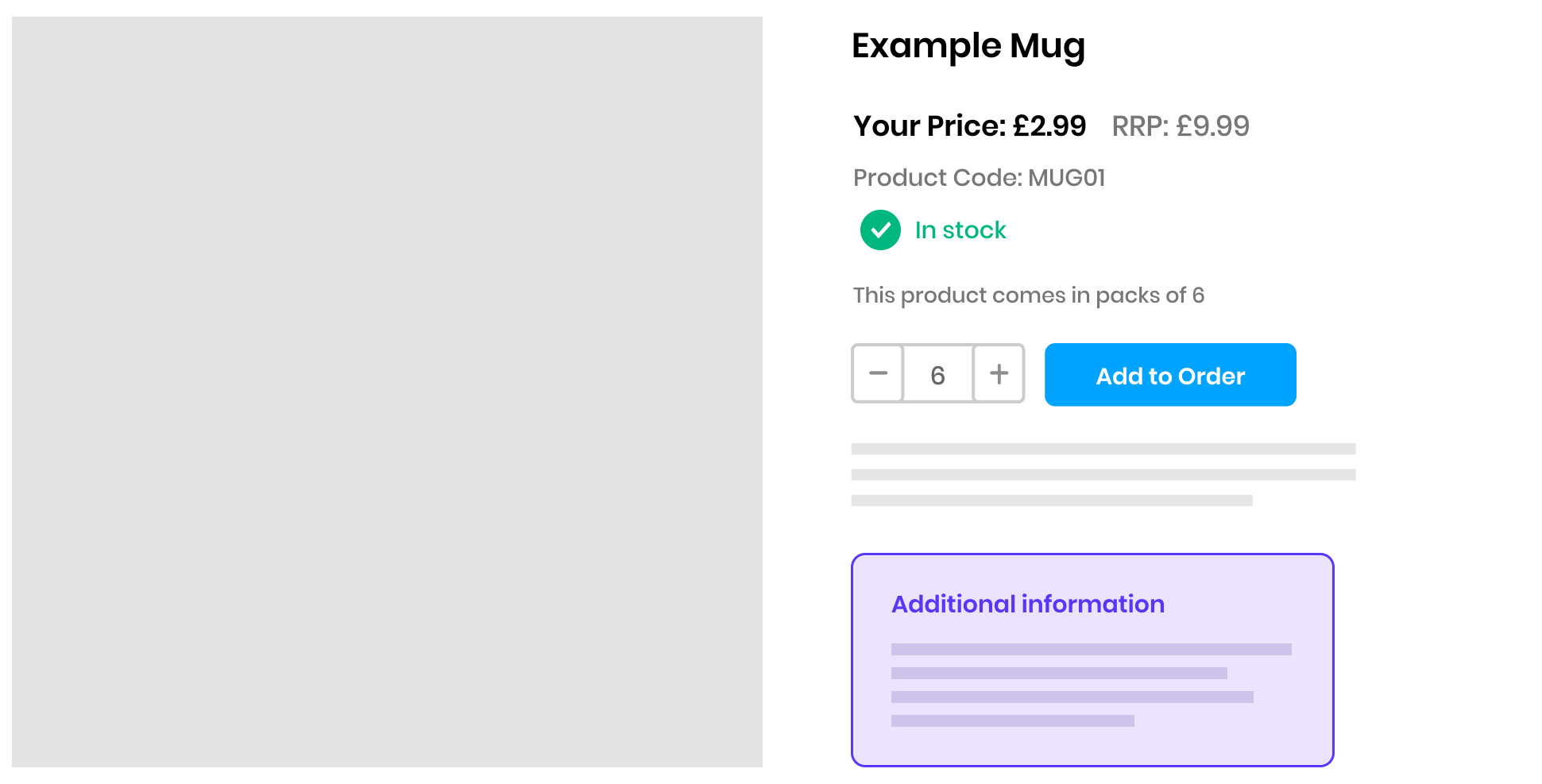
How to implement
Enhancing product data is a feature that all eCommerce platforms should support. This concept may be described as product metafields or product metadata and it essentially allows you to 'tag' additional content to a specific product.
We hope our guide has been useful and we wish you the best of luck in building and growing your B2B eCommerce website!


