Introduction
As B2B eCommerce continues to grow, so does the expectation that B2B websites provide a seamless experience akin to B2C platforms. Surveys indicate that over 90% of B2B customers anticipate a "B2C-style" experience when they interact with a B2B site.
But what does a "B2C-style" experience really mean in the B2B context? Are B2B customers looking for the exact same elements as retail shoppers, or are their needs distinct?
Through this series, we’ll explore how B2B and B2C experiences intersect and where they diverge, covering essential areas like product detail pages (PDP), cart and checkout, account areas, post-purchase marketing, and much more.
Along the way, we’ll highlight examples of B2B websites that demonstrate best practices in these areas and share actionable tips for those building or refining their own B2B eCommerce platforms.
Setting the scene
In the B2B landscape, the purchase journey is often more complex than in B2C. Business customers prioritise streamlined, self-service tools, including clear visibility of pricing and catalogues, bulk-order capabilities, and transparent stock levels.
Unlike retail shoppers, B2B customers may return regularly to reorder, often with specific requirements around quantities and budget constraints. Efficiency and clarity are crucial for these customers, as they frequently manage significant purchase volumes and depend on precise details, like SKU numbers and live inventory status, to make informed buying decisions.
Ease of use is paramount in B2B. Customers value a smooth experience that allows them to find products quickly, adjust order volumes, and finalise purchases without unnecessary steps. To this end, providing self-service features - like access to past orders, saved lists, and quick reordering - greatly enhances the user experience.
When B2B websites integrate these tools effectively, they empower buyers to make decisions efficiently and strengthen long-term customer loyalty.
The Product Detail Page (PDP)
The Product Detail Page serves as a pivotal touchpoint for both B2C and B2B customers, offering a window into the product through images, descriptions, and other critical details.
In the B2C world, the PDP is a chance to extend the brand's message, echoing the visual style and tone set on the homepage.
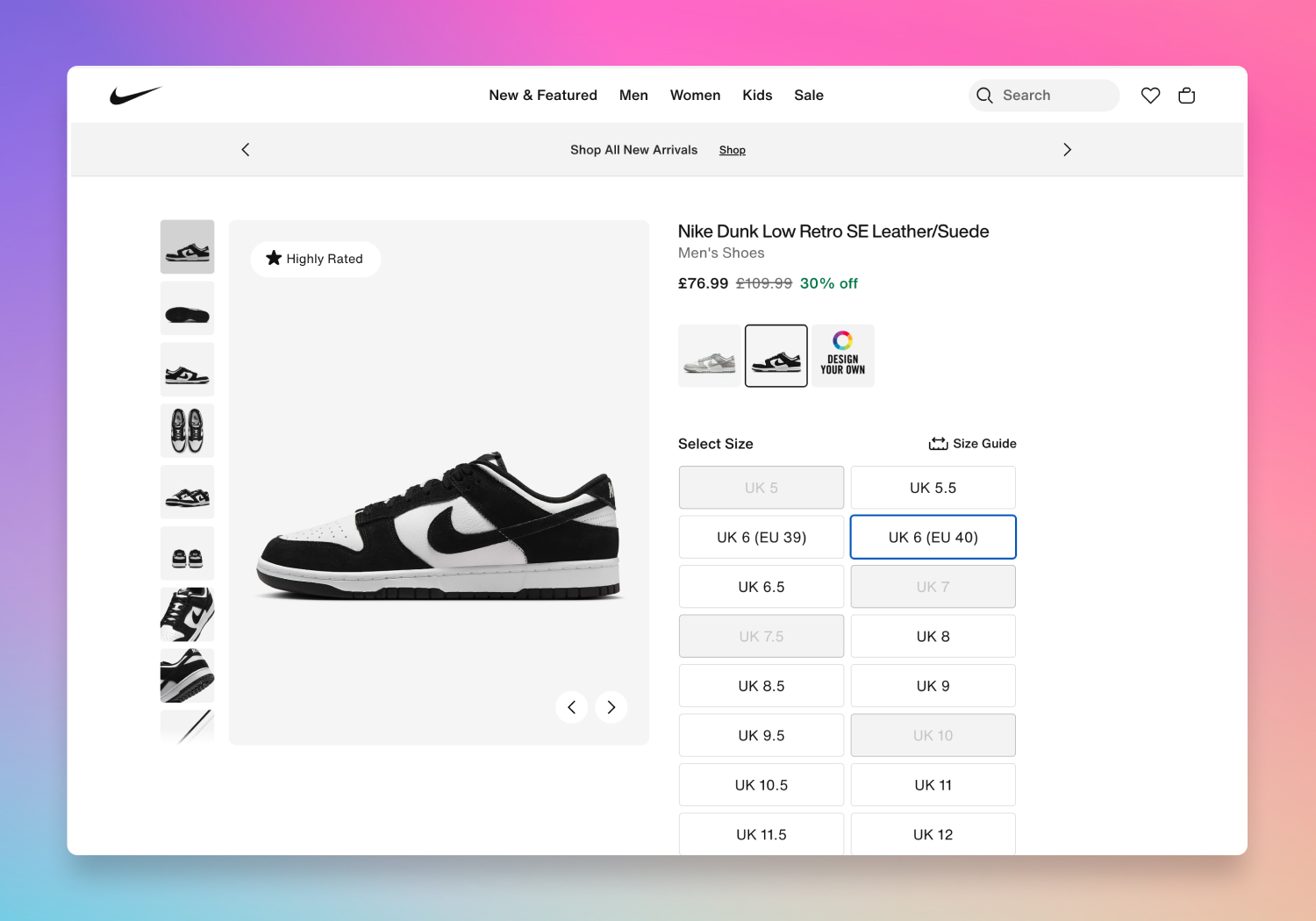 An example B2C product page on nike.com
Key elements of a typical PDP include:
- High-quality product imagery – Close-up, detailed images allow customers to evaluate the product and determine its suitability.
- Product specifications – Key details like dimensions, material descriptions, and usage information help set expectations.
- Add-to-cart and wishlist options – Simple, prominent buttons support the impulse to buy or save for later.
- Customer reviews – Feedback from other customers serves as social proof, helping to reassure potential buyers.
This structure makes it easy for customers to assess a product quickly and confidently.
The PDP for B2B
So, how does a B2B PDP differ? Let’s look at examples from B2B brands like Cubitts Eyewear and Cocopup London to highlight some key differences.
On Cubitts Eyewear’s B2B PDP, the brand's aesthetic continuity from B2C is preserved, with high-quality images and clear product descriptions.
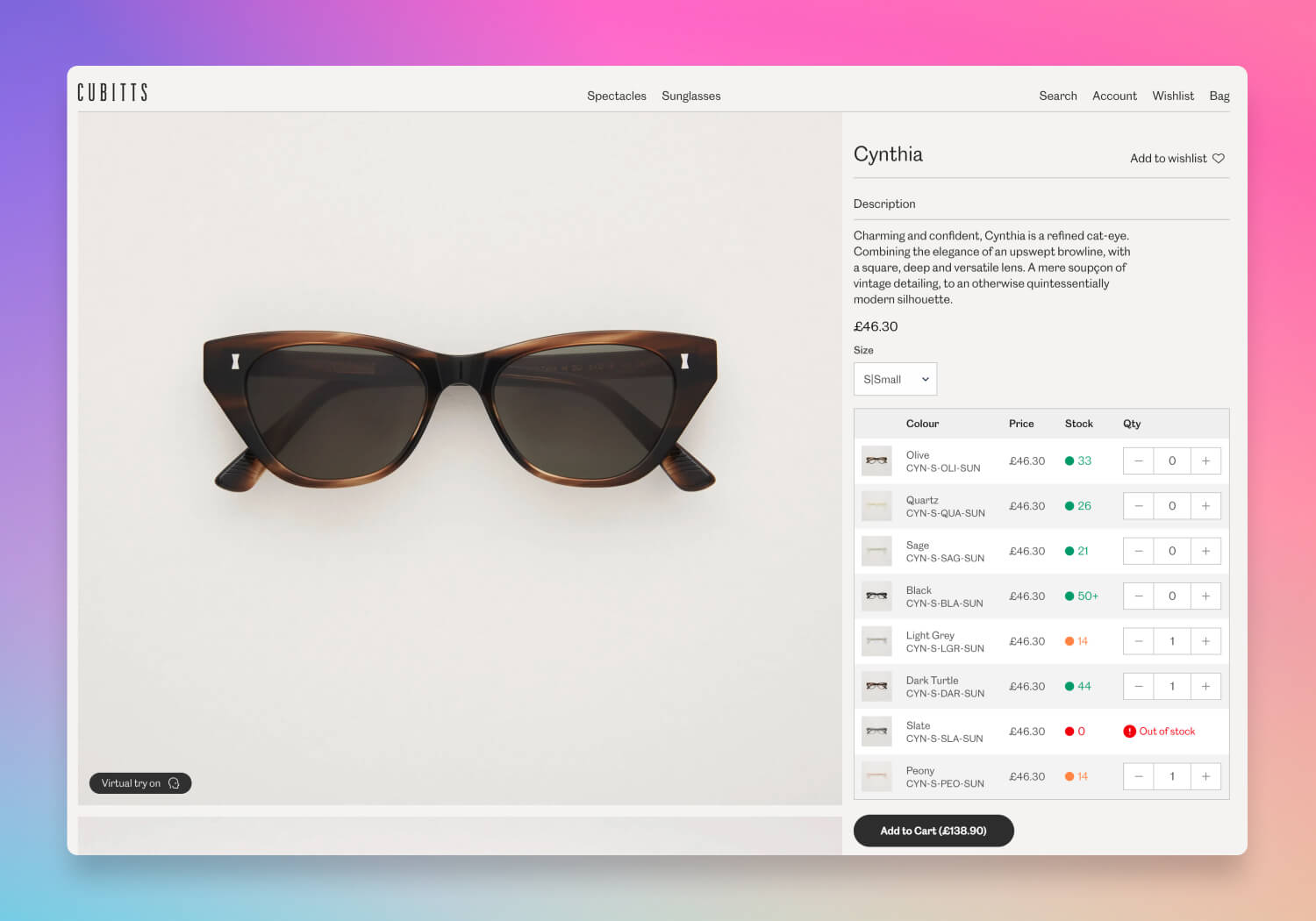 An example B2B product page on Cubitts Eyewear
But there are some notable B2B-specific details:
- Stock visibility – B2B customers need to know current stock levels to plan their orders, so the PDP includes live inventory counts.
- SKU information – Unique product codes (SKUs) are displayed prominently, as wholesale customers rely on this information to manage their own inventory.
- Recommended retail price (RRP) – Displaying RRP helps B2B buyers understand the intended retail price, aiding in pricing decisions for their own customers.
- Bulk ordering options – With the option to select quantities in bulk, B2B customers can add large volumes to the cart more efficiently.
Cocopup London’s wholesale PDP is simple yet strategic. Alongside a price and quantity selector, it displays the RRP, giving wholesale buyers easy access to key pricing information.
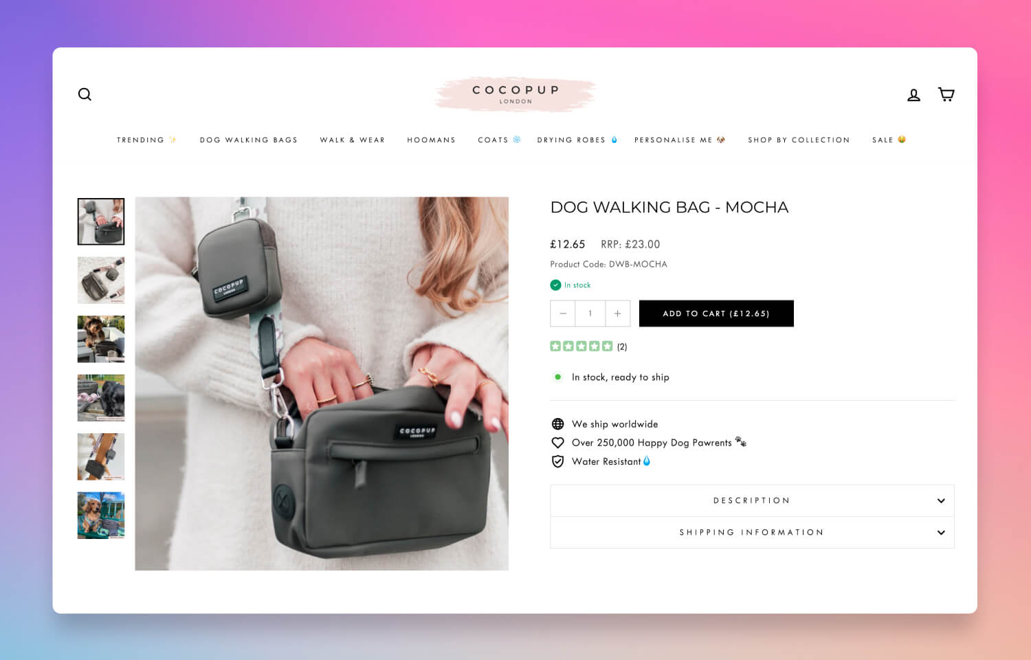
A more simple approach on Cocopups London
These distinctions — like live stock levels, SKU visibility, and quantity controls — are examples of how B2B PDPs prioritise functionality and efficiency over the more narrative, brand-focused approach typical in B2C.
However, not all PDPs are created equal!
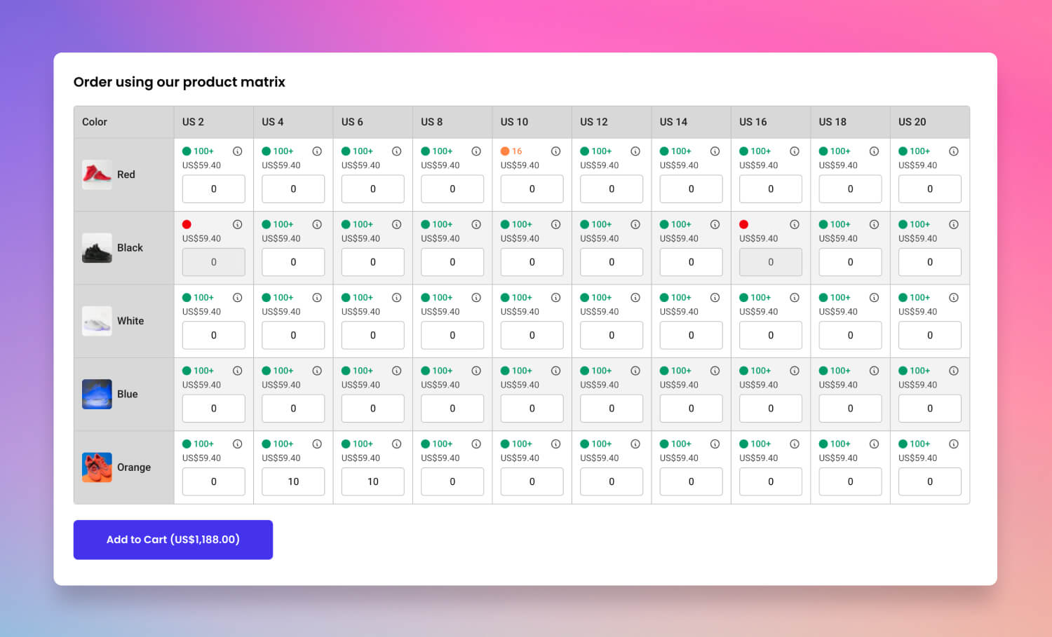
The Matrix view - the ultimate B2B interface!
This PDP features a powerful tool called a 'matrix view', a layout that enables B2B customers to add multiple product variants to their cart simultaneously. Unlike typical dropdown selectors that require users to select each variant one by one, the matrix view displays all variants—such as different sizes, colours, or pack sizes—in a single, organised table.
Each variant is presented as a row or column, with quantity fields that allow customers to enter desired quantities for each option at once. This design streamlines bulk ordering, saving valuable time and effort, particularly for buyers who frequently purchase across multiple SKUs. By offering a clear, consolidated view of all options, the matrix table empowers B2B buyers to manage large orders with accuracy and efficiency, all within the same page.
For example, a wholesale buyer ordering apparel might see each colour and size combination listed in the matrix, enabling them to input the quantities of each without navigating away from the product page. This approach simplifies the experience, making it faster for B2B customers to review and order all required variants and enhancing the user experience on a high-functionality PDP.
The B2B checklist
To help clarify these differences, here’s a checklist highlighting essential elements for both B2C and B2B PDPs:
| Feature | B2C | B2B | Notes |
|---|---|---|---|
| High-quality product imagery | ✓ | ✓ | Vital for product evaluation in both contexts |
| Detailed product specifications | ✓ | ✓ | Supports informed decision-making |
| Add-to-cart button | ✓ | ✓ | Streamlines purchasing in both settings |
| Wishlist option | ✓ | Common in B2C; less relevant in B2B | |
| Customer reviews | ✓ | Primarily a B2C feature for social proof | |
| Displaying SKU | ✓ | Essential for B2B inventory management | |
| Displaying barcode | ✓ | Provides standardised codes essential for inventory and logistics | |
| Live inventory count | ✓ | Helps B2B customers plan their order volumes | |
| Bulk-order quantity options | ✓ | Facilitates high-volume ordering for B2B buyers | |
| Displaying RRP | ✓ | Useful for B2B customers setting their own resale prices | |
| Product variants in matrix view | ✓ | Enables fast ordering across multiple SKUs or product types | |
| Quantity rules (e.g., pack sizing, minimum quantities) | ✓ | Sets required order minimums and increments for B2B orders | |
| Quantity pricing rules (i.e., quantity savings) | ✓ | Adjusts unit prices based on order volume | |
| Unit cost pricing | ✓ | Displays pricing per unit, supporting bulk purchasing transparency | |
| Tax settings (e.g., excluding tax price) | ✓ | Shows tax-exclusive pricing tailored for B2B tax considerations | | |
| Preordering and backordering | ✓ | Allows B2B customers to reserve or order out-of-stock items |
Round-up
By examining the PDP across B2C and B2B contexts, we see a few shared elements — such as quality images and detailed product descriptions — that form the core of a strong user experience. But B2B PDPs take this a step further by incorporating features like stock visibility, SKU display, and bulk-order options, addressing the unique needs of business customers. Whether you're enhancing a B2C PDP for a B2B audience or building a B2B platform from the ground up, these distinctions are crucial to delivering an effective user experience.
If you’d like to discuss how to tailor your B2C platform for B2B customers or enhance your B2B site with a more refined PDP, feel free to reach out - we’d be happy to help!


