Introduction
With more brands evolving their B2B eCommerce experience, there's an increasing need to automate traditionally manual, time-consuming tasks. A crucial step in this direction is providing self-service options that allow B2B customers to manage much of their ordering and account-related processes independently.
By enabling customers to handle routine tasks on their own, businesses not only increase efficiency but also foster customer loyalty, reducing friction and improving satisfaction.
In this instalment of “The Practical B2B UX guide”, we’re exploring the "My Account" area - a central hub that empowers B2B customers with tools for streamlined, self-service account management.
We’ll walk through the core components every B2B "My Account" area should have to improve the user experience and ensure customers can access what they need effortlessly. Let’s dive into the details!
Setting the scene
The "My Account" area provides customers with a central place to manage their orders and personal settings, enhancing convenience and control.
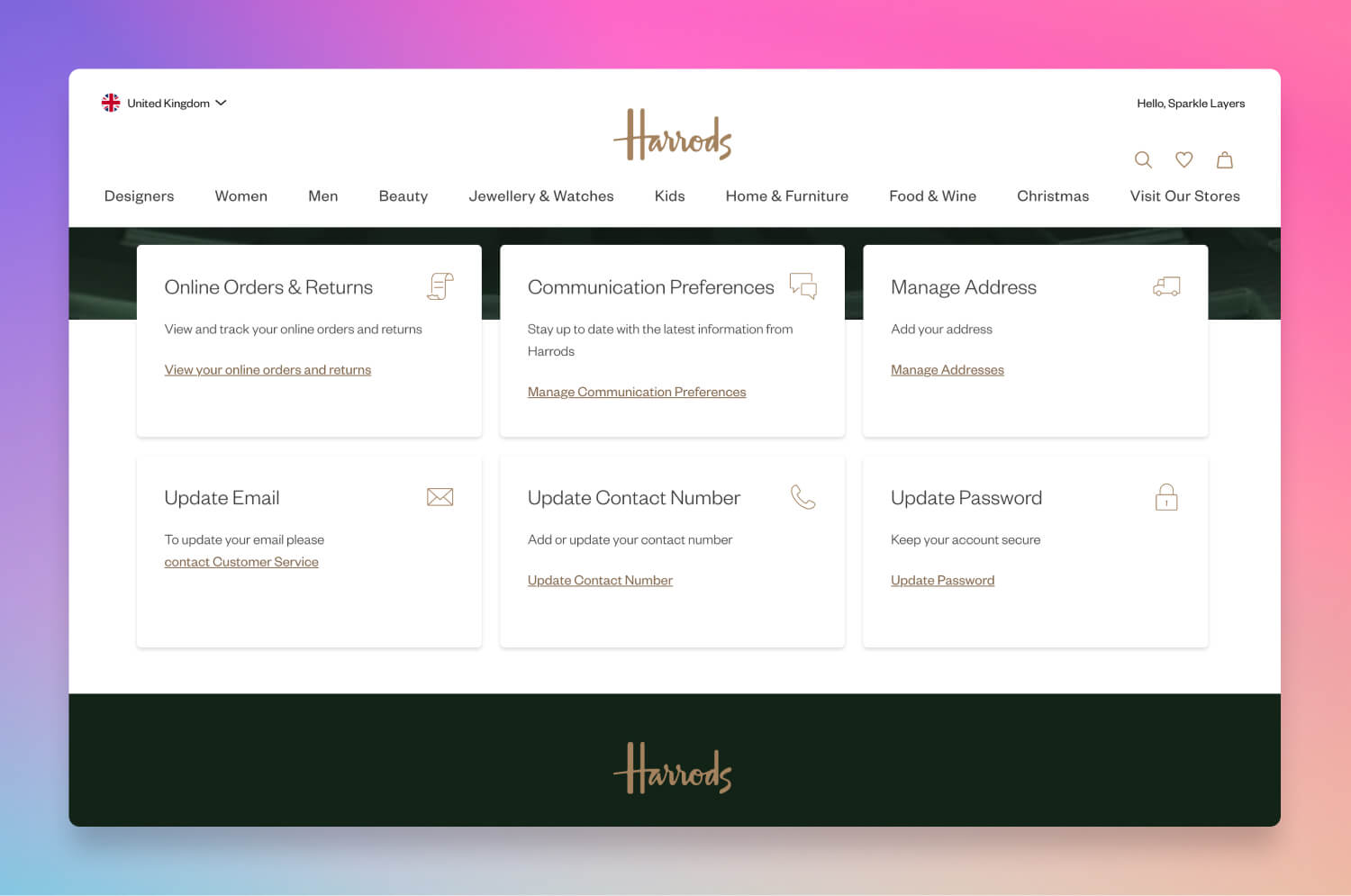 B2C favourite, Harrods, gives customers a feature-rich My Account area
Key elements of a typical "My Account" area include:
- Order history – allows customers to view past purchases, track shipments, and access order details.
- Communication preferences – provides options to manage marketing and notification preferences, offering control over communication.
- Address book – enables storage of multiple shipping addresses for a faster, more streamlined checkout experience.
- Online returns – offers an option to initiate returns, track status, and view refund updates directly from the account area.
Whilst a B2C account area is useful for managing individual, personal details, in a B2B scenario, the My Account area is put to use for so much more. The purchase journey is more complex than in B2C, as B2B customers often have distinct needs, like bulk ordering, managing orders for multiple locations, and custom pricing.
The My Account area for B2B
The B2B "My Account" area serves as an operational dashboard, consolidating functions in a single location and making it easier for them to do business with you. Unlike B2C customers, who may only use their accounts sporadically, B2B users rely on this area frequently and expect it to be robust, efficient, and easy to use.
Creating a comprehensive "My Account" section with the following features can vastly improve user experience for B2B clients and help your brand stand out.
1. Order history and tracking
Order history and tracking capabilities are fundamental to the B2B "My Account" area. Unlike B2C customers, who may track a few occasional purchases, B2B buyers regularly place high-volume orders. Providing a detailed order history allows customers to quickly access past purchases, track shipments, and even reorder items they need frequently.
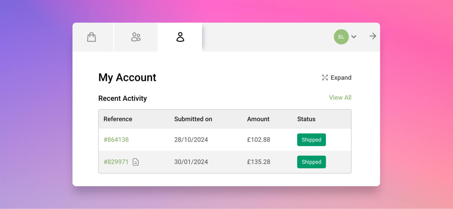
If a B2B customer has multiple users accessing the My Account section, this becomes even more essential, allowing different users to log in and then get full visibility of orders that other team members have put through, and their status and history.
To make this feature even more valuable, consider integrating with back-end systems, such as an ERP, to synchronise offline orders (like those placed via phone or through sales representatives) with online ones and those placed via other channels. This ensures customers have a single view of all transactions, whether initiated online or offline, by themselves or by a sales representative.
Example: Imagine a wholesale buyer who orders inventory monthly. They can quickly view their order history, check when each shipment is scheduled to arrive, and reorder items with just a few clicks - all from within their account area.
2. Shopping lists
The B2C experience frequently has wishlists, where customers can ‘like’ or ‘save’ products in a list, and decide later if they would like to purchase them. Likewise, B2B buyers often place similar orders repeatedly. However, this is more often presented as a shopping list, which is essential for this audience.. A shopping list should allow customers to save frequently purchased items and add them to the cart with minimal effort.
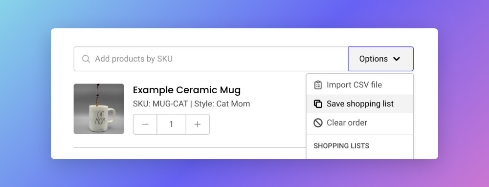
This feature should be easy to access from the account area, reducing friction and streamlining the reorder process. Whilst wishlists are typically temporarily stored for one transaction in B2C, shopping lists can be stored permanently for repeat purchasing for B2B customers.
Example: For a café chain, a shopping list might include recurring items like coffee beans, syrups, and cups. By saving these in their account, they can quickly restock supplies without needing to browse the entire site.
3. Address book management
Many B2B customers manage multiple shipping locations, making address book functionality invaluable. The "My Account" area should allow users to save multiple addresses, select default addresses, and even assign permissions to different team members.
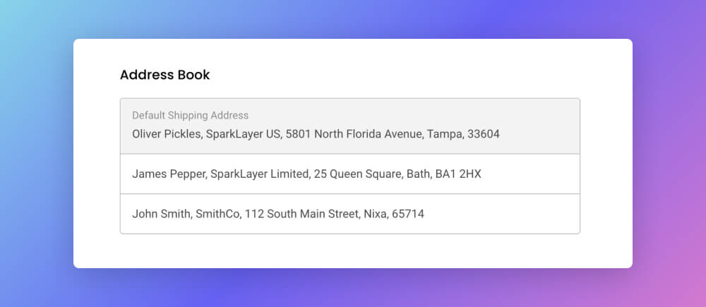
This feature reduces checkout time and minimises errors, ensuring shipments reach the correct destinations. In a B2C context, an account may have a stored address, but commonly the shipping address will be entered at checkout with each individual order.
B2B merchants may actually restrict their customers from adding addresses. This is because a B2B merchant might only want to ship products to approved business addresses, and not risk an individual taking advantage of a trade discount.
Conversely, B2B merchants sometimes want full address flexibility at checkout. This is helpful for drop shipping scenarios, where a B2B customer is shipping a product directly to an end customer.
Example: A retailer with stores across multiple cities can manage addresses for each store location, setting different shipping preferences and allowing specific team members to order for certain locations only.
4. Account credit and payment terms
In the B2C world, card payments are the key form of settling a transaction. B2C merchants may also offer Buy Now Pay Layer services, like Klarna. This is more commonly shown as credit terms in B2B relationships, where businesses often grant customers account-based credit. A well-designed "My Account" area should clearly display account credit limits, balances, and payment terms.
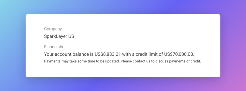
Ideally, customers should receive notifications when they are close to their limit and have an easy way to settle outstanding amounts if they exceed it. This transparency around credit helps customers manage budgets and enhances trust in your brand. This is something you would not expect to see in a standard B2C experience.
Example: A supplier offers a £10,000 credit limit for a loyal buyer. Through the "My Account" area, the buyer can see how much credit remains and when payments are due, preventing them from unknowingly exceeding their limit and pausing future orders.
5. Team access and permissions
In the B2C world, your account is your account. Although you may occasionally have a site which offers a ‘family account’, it is very rare that anyone other than the individual will access this part of the website. B2B transactions often involve teams rather than individuals.
This makes team access and permissions crucial for the "My Account" area. Ideally, users should be able to add team members with different access levels, allowing certain members to view orders only, while others can place orders or approve spending.
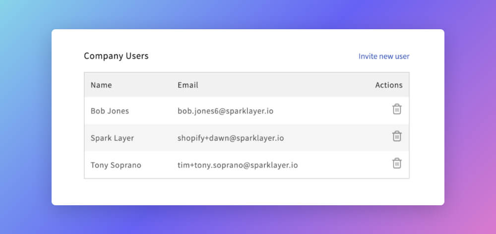
For businesses where multiple employees handle various tasks within the ordering process, this feature is invaluable, enhancing collaboration while maintaining control.
Example: A procurement team at a large corporation might have junior staff placing orders, but only managers can approve purchases above a certain amount. Through the "My Account" area, these permissions can be set and managed.
The B2B checklist
Here’s a checklist that compares the key features of a B2B "My Account" area with those of a typical B2C setup:
| Feature | B2C | B2B |
|---|---|---|
| Order history and tracking | Basic order history | Detailed history, multi-channel tracking, reordering |
| Shopping lists | Wishlist only | Multiple shopping lists for recurring orders |
| Address Bbok management | Single address | Multiple addresses, with options for defaults and restricted access |
| Account credit & payment terms | Usually absent | Real-time credit balance, credit limits, and payment terms |
| Team access and permissions | Single-user access | Multi-user access with permission levels |
| Account information | Basic personal info | Full account details, including account manager contact |
| Offline order sync | Not applicable | Sync of online and offline orders |
Customer spotlight: teapigs
Each of these features may seem small, but, collectively, they create a comprehensive and efficient "My Account" area that supports self-service. This functionality enables customers to manage their own needs, freeing up your team to focus on high-value tasks.
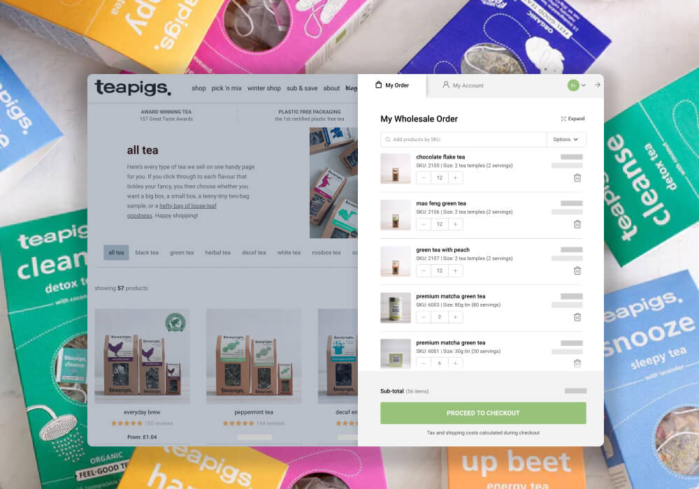
For SparkLayer customer teapigs, the introduction of these self-service features has transformed the efficiency of their B2B operation.
“With SparkLayer integrating seamlessly with Shopify, this has brought a number of key improvements. Customers can order anytime, day or night and no longer need to wait for the teapigs team. Customers are loving the new functionality and teapigs are finally being able to deliver on feedback we’ve been receiving for years." ~ Reece Downey, Head of eCommerce, teapigs
By investing in an effective "My Account" area, teapigs has empowered their customers and enabled a smoother, faster ordering process.
Round-up
A powerful "My Account" area tailored to B2B needs is central to a successful eCommerce experience. When your customers can track orders, manage credit limits, add team members, and access important information independently, they are more likely to trust and rely on your platform for their purchasing needs. This not only drives loyalty but also reduces the need for your support team’s involvement, making the process efficient for both sides.
If you’re ready to enhance your B2B platform with a refined, self-service "My Account" area, our team at SparkLayer is here to guide you. Please feel free to get in touch to learn more!
Explore more in the series
The practical B2B UX guide - designing product pages for B2B eCommerce


